 |
||||||
One Source Signs & Graphics Learning Center
Be an informed Sign and Digital Graphics consumer
|
One Source Signs & Graphics learning center articles and information is provided to help you be an informed consumer. Whether you choose to partner with us or another graphics company we believe you should have the basics so you can make an informed decision. We feel that when you compare our quality (of materials and workmanship), service, customer commitment, and finally price. You will find us ahead of the competition. Remember you get what you pay for! Good signs don't come cheap. Cheap signs don't come good! |
||||||||||||||||
Design Elements Color Combinations Best color combinations used in lettering of outdoor advertising displays ranked in order of legibility or letters from a distance.
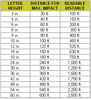
Text Size Distance & Visibility
Colors and Emotions THE PSYCHOLOGY OF COLOURS In selecting colors for an appropriate sign, it is important to consider the psychological connotations of different colors as well as the factors affecting visibility and legibility. (An extensive discussion of the cultural and psycho-physical reactions to co lour is found in Visual Communication Through Signage, Vol. 3, Chapter 3, Claus and Claus, 1976.) Although we will detail the attributes that have come to be associated with certain colors, we do want to point out that the suggestions given below are not hard and fast rules. The sign user should also be guided by his own sense of what is appropriate.
In assessing these colors, remember that fairly subtle shifts in tint and tone can create large differences in how a colors is perceived. While red is appropriate when used in a fairly limited area, when used over too broad an area, it can be overpowering. Simply, pale yellow can suggest daintiness, whereas a deeper yellow becomes a very sensuous and powerful color.
In choosing the color to be used on an outdoor sign, the sign designer or advertiser must keep in mind the characteristics of the group toward whom he is directing his advertising. Research has shown that older people tend to prefer blue because it is easier for them to see. Men prefer deep shades of a color, while women prefer more delicate tints. In addition, there is some evidence that people in lower-income brackets prefer bright, undiluted, pure colors, while those in higher-income brackets prefer more subtle shades and tints. Children also react to certain colors positively. Bright colors attract and hold their attention. Yellows and reds are especially attractive to young children. Some fast-food establishments have selected color combinations which appeal to young age groups; for example, McDonald's emphasizes yellow and red. It is also important to remember that how people feel about a color is very much influenced by the context. When people list their favorite colors, red has very high rating. But when red is associated with a kitchen, its preference rating drops considerably. Colors of the peach-pink family also receive increased preference ratings when associated with cosmetics, but drop in preference when associated with hardware. Colors used on illuminated signs are also influenced by the time of day. Many spectacular night time displays look poorly constructed or maintained under the harsh light of day. If a 24-hour image is important, attention should be paid to how a sign looks throughout the entire day.
Signs: The Secret to Getting Results from Your Advertisement SignLarge Format Printing for your Business Advertising Signs The Benefits of a Quality Custom Magnetic Vehicle Signs Maximizing Vinyl Signs as a Winning Alternative to Paper
| ||||||||||||||||


Home • About Us • Services • Gallery• Contact Us• learn
© -One Source Signs2003-2008 All RIghts Reserved.